Zroblocks
Zroblocks
(
2026
)
Zroblocks develops IoT threat detection for enterprise networks. Instead of flagging breaches after the fact, it profiles device behavior and catches anomalies as they happen - before they spread.
I took this on as a self-contained design challenge: own the full homepage, end to end, within a three-day window I'd set for myself - concept, system, and production-ready code.
role
Visual Designer & Design Engineer
Industry
Cybersecurity, IoT Infrastructure

The challenge
Too Many Doors, No Way to Watch Them All

IoT networks aren't one system - they're thousands of small, mismatched ones. Most security tooling is built to investigate after a breach, not to see the sprawl in real time.
The homepage had to make an abstract, backend-heavy product feel immediately credible to a technical, skeptical buyer - without leaning on the usual padlock-and-shield clichés.
Solution
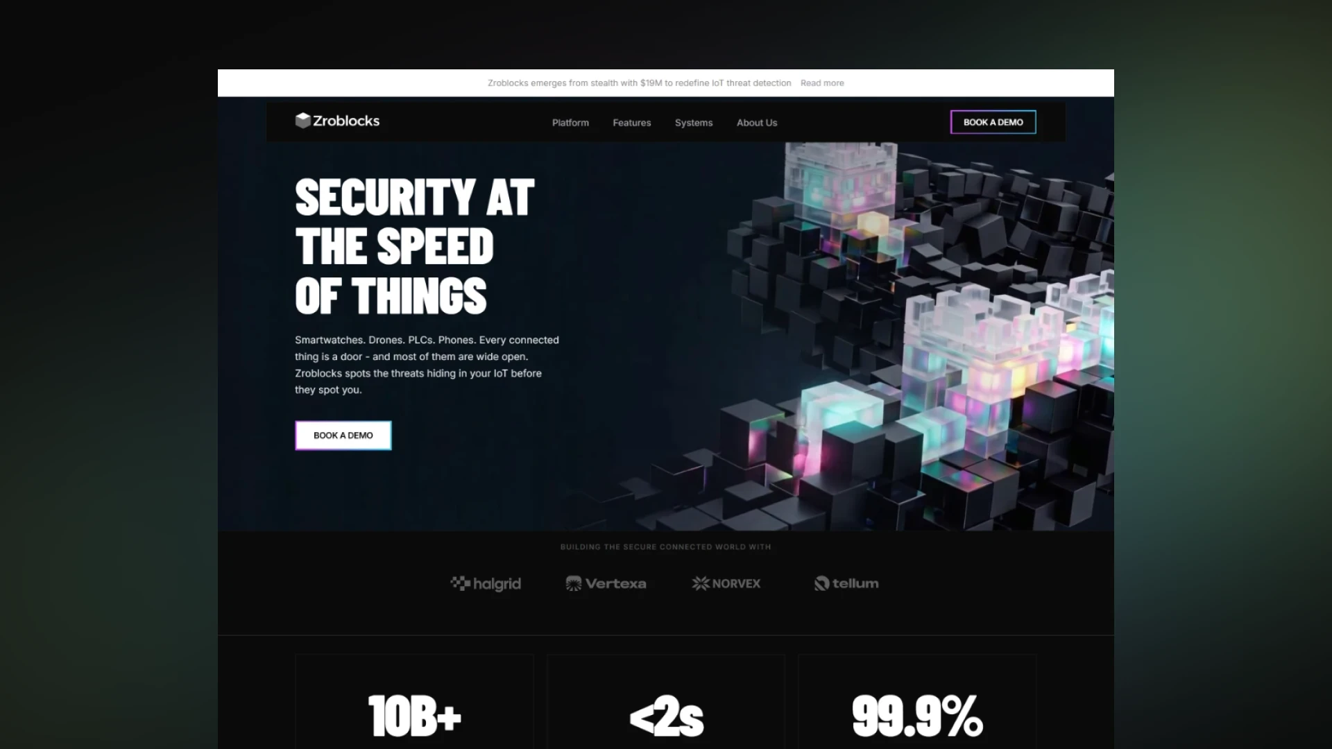
I built the page around a single visual system rather than a set of stock security tropes: a modular structure of cubes, some solid and opaque, some glowing glass - one material for stability, one for the constant motion of data across a network.

The Concept: From Cube to Wall
The Cube
The brand's existing mark was a cube. Rather than treat it as a fixed logomark, I used it as a seed - sketching what a system built entirely from that one shape could look like at scale.
The Wall
The strongest direction drew on the Great Wall: not literally, but as an idea. A wall is defense that doubles as a status symbol - built to last, visible from a distance. Small tower-like clusters echo actual watchtowers, giving the metaphor a concrete anchor instead of leaving it abstract.
The Materials
Opaque blocks say this holds. Glass, glowing blocks say and something is still moving through it. That pairing is the visual core of the page - solid enough to read as infrastructure, alive enough to read as a live network.
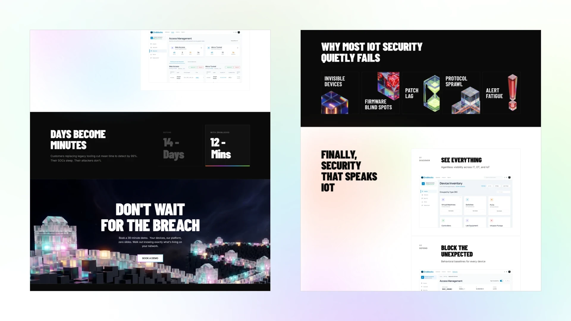
The same logic carries into the problem icons: clear glass disperses light into a full spectrum at rest, so a single saturated hue reads as a signal - red for a live threat, green for time passing.
The cube itself never disappears; it just shrinks, into the dot of an alert mark or the grains in an hourglass.

AI Workflow Loop Walkthrough
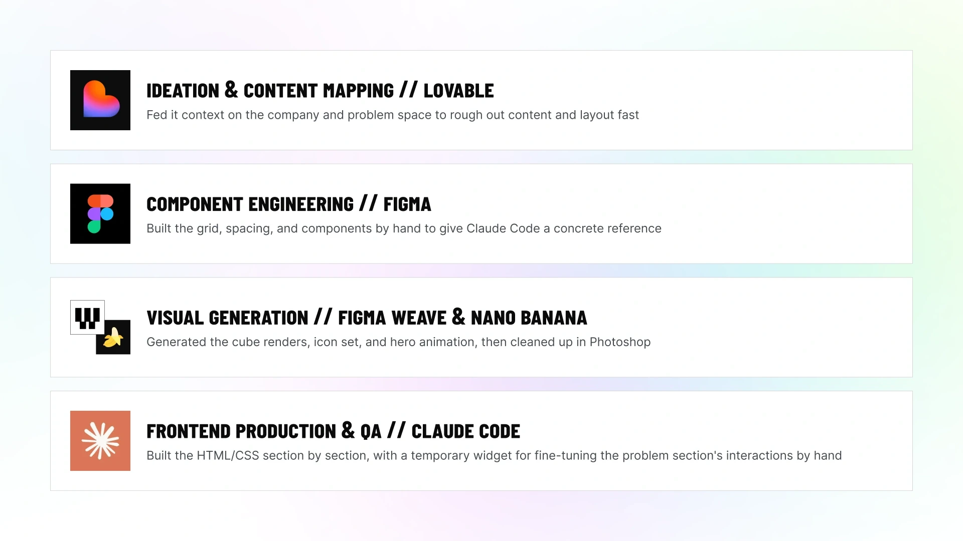
Delivering a full homepage: concept, visual system, and production-ready code- in three days meant skipping the usual back-and-forth between design and dev, and building a fast, AI-assisted pipeline from the first sketch to deployment.
Phase 01 / Ideation & Content Mapping (Lovable)
Fed Lovable context on the company and the problem space to rough out content and structure fast - a way to test what the page needed to say before touching real design tools.
Phase 02 / Component Engineering (Figma)
Rebuilt the layout by hand: grid, spacing, reusable components. This gave both me and Claude Code a concrete reference to build from, instead of an abstract brief.
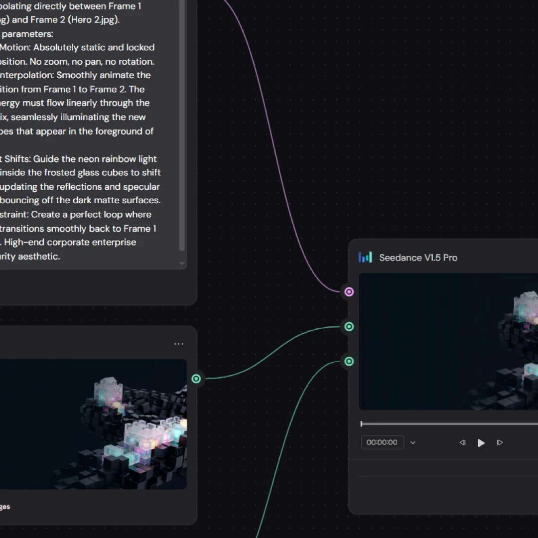
Phase 03 / Visual Asset Generation (Figma Weave & Nano Banana)
Generated the 3D cube renders, icon set, and animated hero loop, then color-managed and cleaned up in Photoshop.
Phase 04 / Frontend Production & QA (Claude Code)
Built the semantic HTML/CSS directly from the Figma layouts, section by section. For non-standard patterns like the problem section's interaction states, I had Claude generate a temporary widget I could fine-tune by hand in CSS - more control, fewer tokens spent. Finished with a full responsive pass, desktop-first per the brief.

I wanted a system where strength and motion weren't in tension - where the same shape could feel like a fortress and a live network at once.
Key Outcomes & Reflections
What Worked
The cube system held up across the hero, the icon set, and the closing section - one shape doing a lot of work without needing a different visual language every time.
Trade-offs I'd Flag

The hero animation is deliberately subtle - a slow shimmer rather than visible motion, so it wouldn't pull focus from the headline. The product section drops the cube language almost entirely in favor of clean screenshots, tied back to the system only through a soft scroll-linked gradient in the brand's colors. Both were conscious calls to keep focus where it mattered most, not oversights.
What's Next
Given more time, I'd add more visualization to the product story itself: simple diagrams, motion, small animated walkthroughs of what the system actually catches and blocks, so the product is easier to grasp at a glance, without relying on screenshots alone.
This was the first project I built fully AI-native: designing directly inside the development environment instead of finishing a mockup and handing it off to be coded. Having a working knowledge of HTML and CSS made that shift fast: I could tell exactly where the boundaries were and direct changes with precision instead of guessing. Claude felt less like a tool I prompted and more like a build partner - I made the design calls, refined them in plain language as I went, and it translated each one into working code.